

The inspiration for this poster all started from a photograph I took of one of my peers (shout out to Rachel, thank you!) when I was trying to build up my stock library. I set my camera to RAW, which gave me greater control of the image in post. Then I cut her out of the image using the Magic Wand tool, (to get rid of most of the green) followed by Colour Balance, focusing on green and yellow, (to get rid of any bleeding from the green screen) and finally the Eraser (for the tricky parts).

Going with the idea of having a film centred around a reporter I thought of doing a poster for a documentary movie, following the reporter and the story she wants to tell the world!
Immediately my boy brain went straight to a film about war… so I began to research that genre of film to see what others had done.

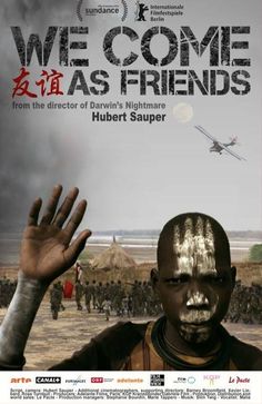
I found the recurring hand gesture interesting in those above. It's possibly to convey innocence and harmlessness or a sign of surrendering to someone or something. However I found most posters focused on the victims of conflicts, by right of course. However, I wanted to focus on the reporter, which might come across as inappropriate. This was my first sign that I was tackling the wrong theme...
I started researching what kind of images would tell the viewer, straight way, what the movie was about and potentially look like a still from the movie.
 |
| Illustration of the Brotherhood of Steel hard at work - Unknown Artist |
Ignoring the ‘meme’ text, I really liked this image. I couldn't find the original painting so apologies for not crediting you, fantastic stuff by the way! The posing, the colours, the smoke and the nice motion blur effect really sells a dramatic, intense story. Even though the contents of the illustration are on a small scale. It doesn’t need a big set piece of large scale action because it leaves enough for the mind to start filling in the blanks while also encouraging mystery. Who / What are they after? Why?
 |
| Nazi March - source lost |
 |
| Fighter Squadron - source lost |


Looking at other examples of documentary films I noted that the tone of most of these films was very serious.
Looking back at the decided main image, the reporter, I finally realised what I liked about the picture. I liked her relaxed pose, the absurd bundle of cameras, her slight smile and her out of place and casual looking shoes. It’s all very tongue in cheek and so I needed to match the subject matter with that.

Looking through my stock I was thinking of making a silly super villain organised crime sort of documentary poster. It still wasn’t clicking for me though.

Eventually I went away from the guns and grit...

I started looking at some more tongue in cheek looking film posters and ones that focus on main characters.
A few things I noted were the use of two main colours and emphasis of the pose. A definite, specific location isn’t necessary, maybe just suggest the background instead!
My First draft :

For my first draft I had the idea of placing her on a wall with a city in the background but I got caught up in fiddling around with a more abstract style. I made the wall by creating a Lasue as big as I wanted the wall to be, made a red & white gradient and then created depth by warping and blending textures. The background is made of a few gradients and a Posterize filter.

I started to double down on the red carpet look and inserted a still from a music video I worked on with a local band. I wanted the poster to represent a movie uncovering the woes of music production. The bumps and hoops you don't see on the surface!
Second Draft :

I thought the background was too busy so I played around with the band picture.


I used Threshold to make the band picture a black and white image. I blended it with textures I made and used the Heal Tool as well as the Pattern Brush in between each texture image to create, an over all, stain on a seat cushion kind of look.
When making the logo I went for a backstage ticket look and yup, ‘BS’ is intentional. I made it with simple application of the Lasue tool, Text Editor and basing it off a type face called Budmo.
I thought the first one looked too much like a modern mobile phone, the second was unclear and the third suggests the cinema or a funfair, so I went with the last one!

I then filled in the negative space with a tagline and placed the credits at the bottom. I believe it is very effective at drawing the viewer’s eye around the poster.
Starting at the centre of the page (because that's often where people begin to look at a page) and ending at the credits.


A few lens flares here and there, getting rid of any branding and boom, 'twas' done!
 If I was to go back and change anything it would probably be the ratio of negative space, comparing the foot to the left border and the tag line to the right of the border. The image is far too heavy on the left I feel.
I believe I did try to fix this a few times but ran into issues. If I moved the figure she wouldn't be looking at the title and if I moved the title with her it would block the heads of the background band, making it even harder to distinguish whats there.
If I moved the tag line it would be harder to read because of the way I had it's blending and colour effects set up and it would have to be re-warped to fit the shape of the wall ...and I had deadlines...
In conclusion it was a fun project and I learned a lot when it comes to Photoshop and movie poster making. I feel prepared to take on something more challenging!

We shall 'shlaters',
Richard.